Friday, November 13, 2009

Yousef Karsh


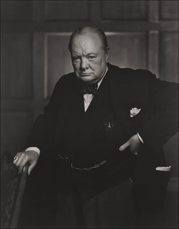
This is probably Yousef Karsh's most famous photograph of Winston Churchill. I love the story behind this photo and I think that it's important enought to be put on here, this is what Yousef Karsh has to say about this photo: http://karsh.org/#/the_work/portraits/winston_churchill/


So since our latest assignment is Portraits, i thought i would put this photograph up first. I love the light on this photo, and it's a beautiful photograph.


so since google is being stupid and i can't find this picture, i'm just gonna post the page it's on cause i really like this picture.

I love the lines in this picture and how the poles fade to the distance. I love how the delivery man is in the corner because it disrupts the symmetry in the picture. I also love how the man gives you a reference point on how tall the poles really are.

Tuesday, November 10, 2009

Assignment 5: Free Shoot

This isn't my favorite picture but i like the foreground-background relationship. I thought there was an interesting texture to the tree. But the light sucks.

I actually like this shadow photo better than the other one because the pose to me looks more meaningful and interesting.

I love the light around this time, that yellowish light is gorgeaus. Anyway i was thinking of photos i could take and i saw how it looked like i was leaning against the tree even though i wasn't anyway i thought it was a pretty cool photo.

I think this photo is really interesting......although i'm not quite sure what it is....it was like a vent like this on the side of my house....well it looked cool when i looked through it so i decided to take a picture of it. I actually really like this photo i really like the light.

Not my favorite picture either but i like the depth of field. Although i hope that the first post isn't so blurry that it's distracting.

This is probably my least favorite photo yet. It's plain and blurry.

I think this photo is really interesting. I like the depth of field and I really like the light. The other thing that i really like is the composition of this photo.

I like this photo although it's not my favorite picture ever. My goal was to put the focus exactly where it was, but once i started working on it, i started to question whether i should have put the focus on the round base in the background.

At first i thought that i wouldn't like this picture when it showed up in my library, but the more i worked on it, the more i liked it. I like how the top of the lamp matches the background.


I really like this photo. I like the shadows on the object. The only thing that i'm not to sure of is that the lines of the blinds are not parallel with with base of the photo.

Sooooooooo........this was my dumb moment of the year. I had changed something on this post before the term was over and when i thought i published it as a post i accidentally saved it as a draft. So, here are my Assignment 5 pictures.

Tuesday, October 27, 2009

Halloween Assignment


This was one fantastic project Slade. Kudos to you! So me and my friend went out to the graveyard at like 10 (so this might be stretching it.....it was actually like 7:30 but shhhh!) at night and it was super scary cause these people kept following us, and yea. So i only got 18 pictures and i only like about 2 of them, but I'll put those two up. The first one i really really like because you can see her face in two different places and it's ominous. The second one i really like cause she's so blurry that she's actually almost transparent. Anyway this was an amazing/scary assignment.

Note to self: I WILL CONVERT THESE TO B&W!!! Eventually.....

Assignment 4: Complimentary Colors

I like this picture it's just too bad it's not complimentary

probably my least favorite picture but it's a picture. It's too boring in my opinion, and i think my depth of field is funky.

BLURRY!!!! but i have to say i like the composition....like most other pictures here. If only if only it wasn't blurry. :( So i used to like the light on this one, but now i'm wondering if the highlight at the top is too distracting from the picture as a whole.....

This is my favorie picture so far, i like the composition of this picture a ton and i love the colors. I really love how close i actually got to the "subject" but also how the bracelet doesn't lead your eye off the picture. I just like this picture as a whole.

So i like this picture too, although the glare on the cups i'm undecided about. The glare could "make or break" the picture.....ok maybe that was a little dramatic but i'm thinking it's just a little bit distracting. Lesson leaned: pay attention to glares next time.

not my favorite picture....Fruit seems a little cliche....


At first this wasn't a picture I particularly liked. But the more i looked at it, the more it grew on me. I like how you can see the whole dress in this picture, because lately in most of my photos all i do is get really close up to the object and take a picture of PART of the object. This picture was a change from that so i liked it. Also it's on a yellow background and it's hard to find a something that's NOT your object and act as a background and be yellow. Well maybe it's not that hard but in my opinion it is.....


again not my favorite picture and it's a little blurry......i blame my cheapo video camera tripod....although that's probably wrong, and i'm probably the one to blame.....but in my mind im blaming the tripod. Anyway i like the colors. I tend to have a lot of green around my house......


I really like the colors in this picture, they're so bright and colorful.......i like how your eye follows the belt but can still linger in the midde because the fabric raises it up giving it a 3D look.


I really like the depth of field in this picture. And i really hope it's complimentary cause Daniel says it's pink but i swear it's red.


I also really like this picture, I like the composition of it and also the colors. Although it does seem a bit commercial to me, but i'm not saying that commercial is a bad thing. I actually really like this picture. And for once in my life it's not blurry because of the help of my cheapo tripod!


This one i don't like as much as the other purse one but i do like the composition of the wallet. There's just something inviting about it. Like it's saying "Open me! I have money!" I only wish......

Tuesday, October 20, 2009

Irving Penn

Irving Penn, born on June 16, 1917, initially wanted to become a painter. Although at age 26 he took a job designing photographic cover for the fashion magazine "Vogue". Soon he was known as a fashion designer. Penn also became an influential portraitist. He photographed many celebrities, moving that celebrities personality into the photograph.
This photo instantly drew me in when i was on Google images looking at different Irving Penn photos. There's something about the picture that makes it mysterious but beautiful all at the same time. The details on the dress are amazing and the shadows in the background illuminate the girl.

Friday, October 9, 2009

Assignment 3: Monochromatic


So this is my favorite picture ever. It's blurry except in the left-top corner which would draw your eye out of picture which is not what we want.

This one is blurry too but i like the composition better than the other towel one.

This is probably my least favorite picture here and i'm not sure if it's even monochromatic but the design is sorta cool.

This is an ok picture. Not the best, but not the worse.

I kinda like this picture cause it is in focus. And i just think wood is interesting in general.

I also like this picture just cause it's all different green vetables. Although the handle of the bag is just a tad distracting.

I really like the light on this picture and also the the ripple of the fabric is nice.

I really really like this picture. It's the bottom of my shoe and also it's in focus which is amazing for me. I also like how you can see the texture on the lighter black but how it's sort of faded because of ware.

This one's pretty good, if only the ripple was in focus. Ugh i have focus problems.

I really like this picture, first off the light is really pretty and i like how it's pretty vibrant but it's not too vibrant to be fake.
]
I also really really like this picture. I like the composition of this photo even if it has a little brown in the picture i think it's close enough to be monochramatic.

This is one of my favorite pictures, and also one of my first pictures. I love the light and also the composition of this photo. I also like how the shades of greens very from very light to very dark greens.

Monday, October 5, 2009

Before and After


And this is my after after image once Slade made me realized that i blew out my blacks. So i redid it and this is the newer retouched version.


And this is my retouched version. I really hope it looks natural. It looks natural to me but there's a super duper huge change!


So this is my orginal picture. As you can see the lighting is horrible because it was taken in my basement with REALLY yellow lights, it's also sorta blurry even though i had a tripod. It's sad..... Well anyway this is the original